Type
Web App, AI
Work
Architecture, Design
Role
Sole Product Designer
When
Jan 2026
Integrating notebook-style workflows into an AI platform for data scientists
Cambercloud
Context
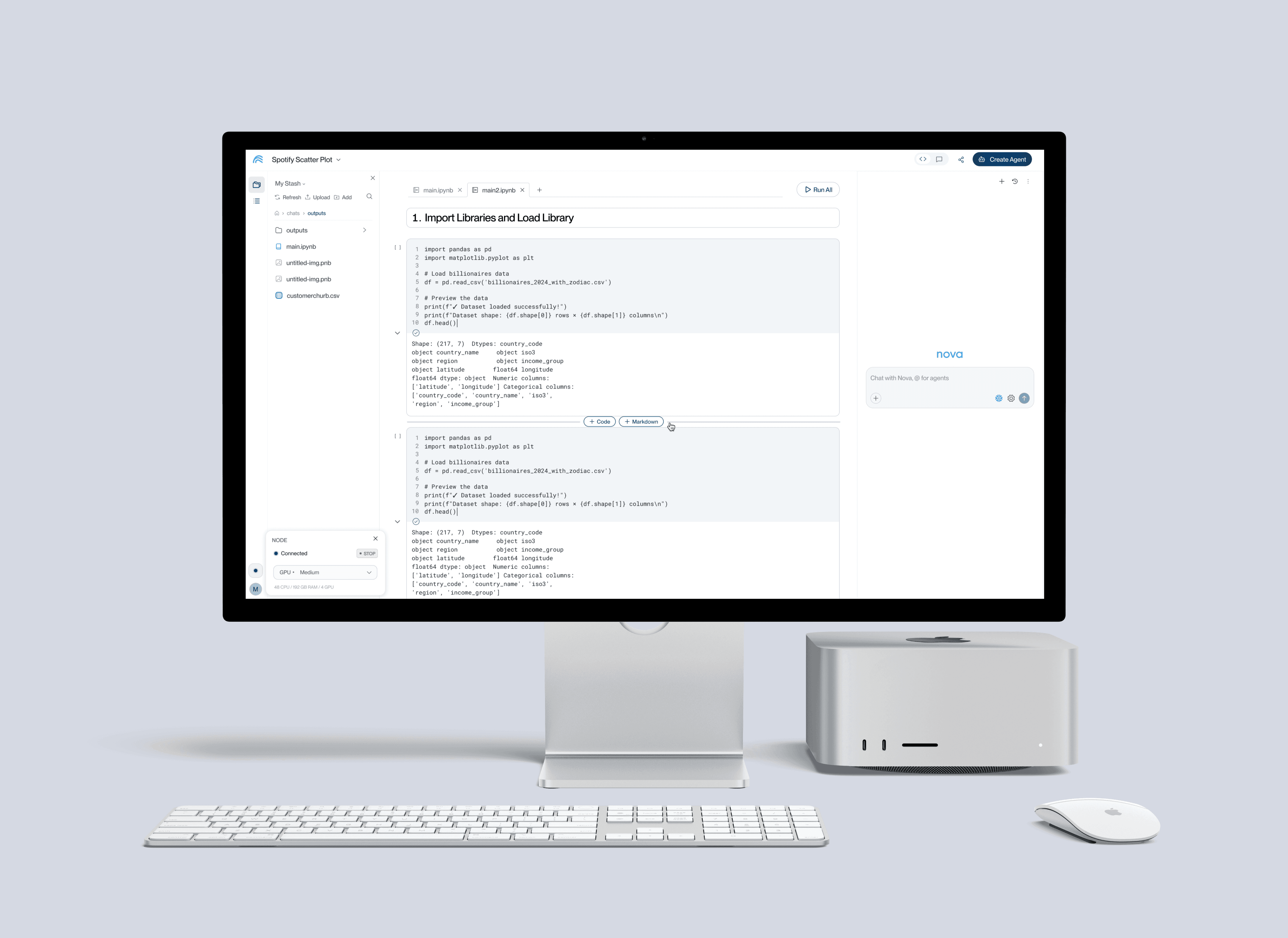
Camber is an early-stage AI agent platform with a small founding team. I was the sole product designer, working directly with the founder and engineers. No design system, no existing patterns for this kind of hybrid experience, and the platform was already live and being used by early adopters.
My Role
I owned the notebook experience end to end: mapping Camber's existing architecture, studying the tools data scientists already rely on, and stress testing layout concepts. I designed the notebook view and the navigation changes it required, then worked with our engineers through handoff and build.
Camber started as a conversational AI tool for researchers. When the founder decided to pivot to data scientists as the primary audience, it landed on my desk as a design problem: how do you introduce a notebook view into a product that was built entirely around chat? The architecture wasn’t designed for it. There was no established pattern to follow. It was my job to figure out how it fit.
Where the real work was happening -somewhere else
Before the notebook existed, Camber worked like this: you asked Nova a question in chat, it ran your calculation, and if you wanted to actually tinker with the code, you clicked “Open Jupyter Hub” and left the product. The real work happened outside the thing we were building.

Research
I went through the notebook platforms data scientists already live in, looking at where the file browser sits, how cells execute, and what surrounds the canvas.


What the notebook view had to contain
I deliberately kept all three close to the standard rather than reinventing them. Data scientists have years of muscle memory in Jupyter, and post-launch numbers show how strong that habit is: traffic to the old Jupyter route still runs 70–170 uniques a day against the in-app notebook's 15–66. A notebook that behaved differently from the one they already know would have been one more reason not to move.
One more requirement sat underneath all of it: regular chat mode had to stay. Non-technical users were still a core part of the audience, so the notebook could not become the only way to use Camber.

The challenge: architecture integration. Where do we put it?
The notebook needs a file browser, a wide canvas and a chat panel. Camber already had a primary nav, full-width pages, and a Stash panel using the same space. Three problems surfaced immediately.


What existed, and what the notebook needed.
01
Chat mode can’t go away
Non-technical users still needed regular chat mode. The notebook had to be an addition, so users needed a way to switch between chat view and notebook view.
Created a toggle for users to easily switch views for their need.
02
It can’t just go in the existing nav - the Stash clash
The obvious move was to open the notebook next to the primary nav and put its file browser beside it. I mocked it up, and it didn’t work.


× Less space for the code cells in the center panel.
× It takes up more horizontal screen space overall.
× The chats list and the Stash sidebar list compete with each other.
× A full-page Stash already existed, so a second Stash in a sidebar could be confusing.
CONCEPT 01 · NOT SHIPPED
Scrap the existing nav bar and rebuild it as something more space-efficient
Collapse the primary nav into a narrow icon rail, then give the freed width to the notebook: file browser, canvas and chat all visible at once. Every nav destination becomes a panel that slides out of the rail.

Chats in left sidebar

Stash in left sidebar

Connectors in left sidebar
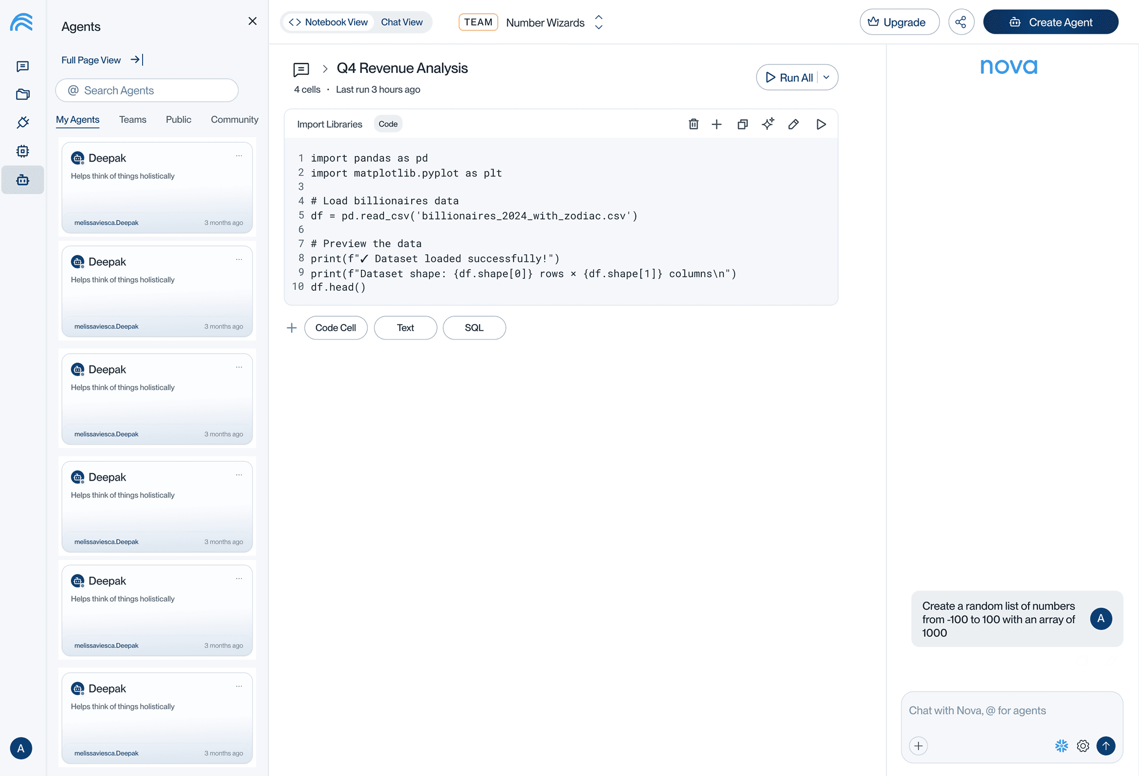
Agents in left sidebar
I stress tested it against other scenarios, and it broke in three places.
× It doesn’t hold up outside the notebook. Pages that have nothing to do with the rail - settings, forms or an instance - would still need a full-width, edge-to-edge layout.
× It doesn’t scale with the product. As Camber matures the nav takes on more; the platform won’t stay this simple, and the rail has nowhere to grow.
× It’s the most expensive option for engineering. Every existing full-width page would have to be converted to sidebar widths.
CONCEPT 02 · SHIPPED
Keep the primary nav as is, and give the workspace its own focused view
Instead of rebuilding the nav, I left it alone so it kept all its conveniences. Opening a workspace moves you into a focused view with its own slim nav, without the distraction of the primary nav. Chat view and notebook view both live inside that workspace.
01 HOME
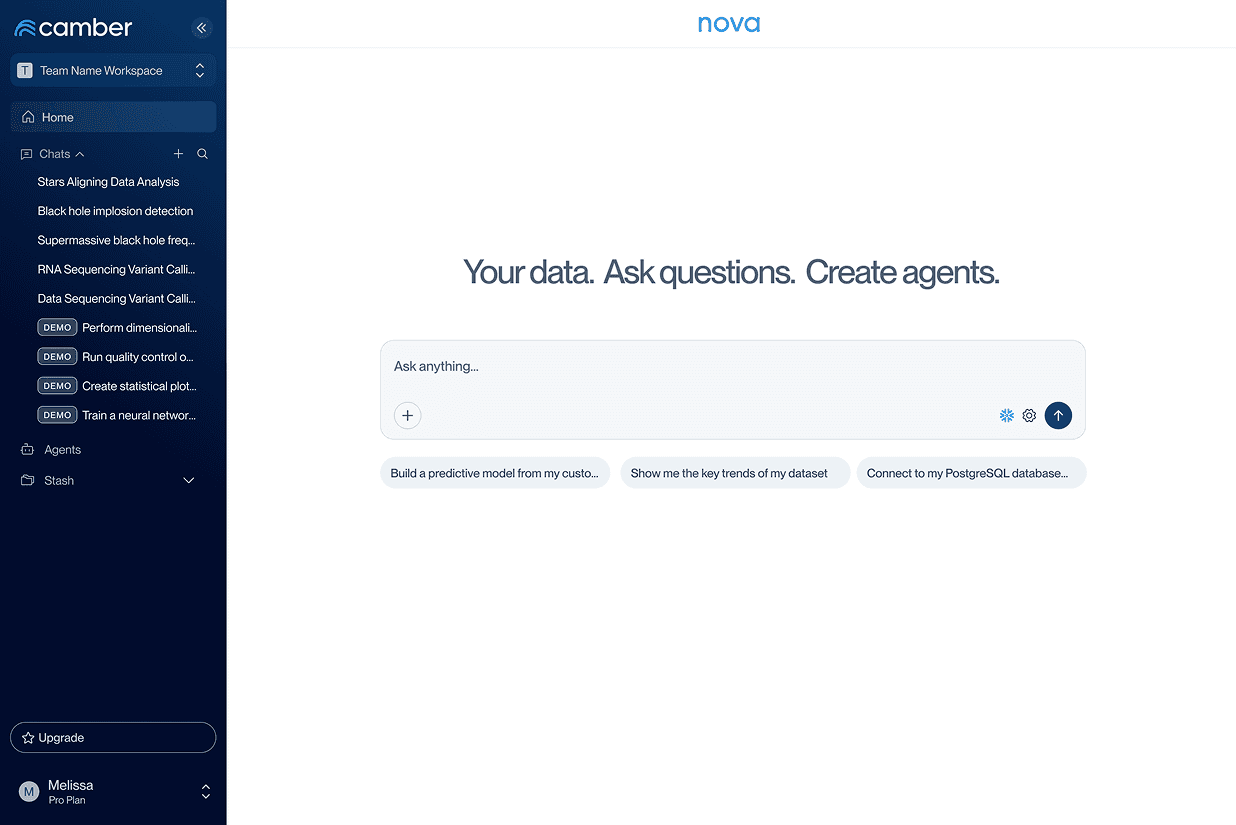
Home, with the primary nav unchanged.
02 WORKSPACE

A workspace opens into a view with its own nav.
03 NOTEBOOK
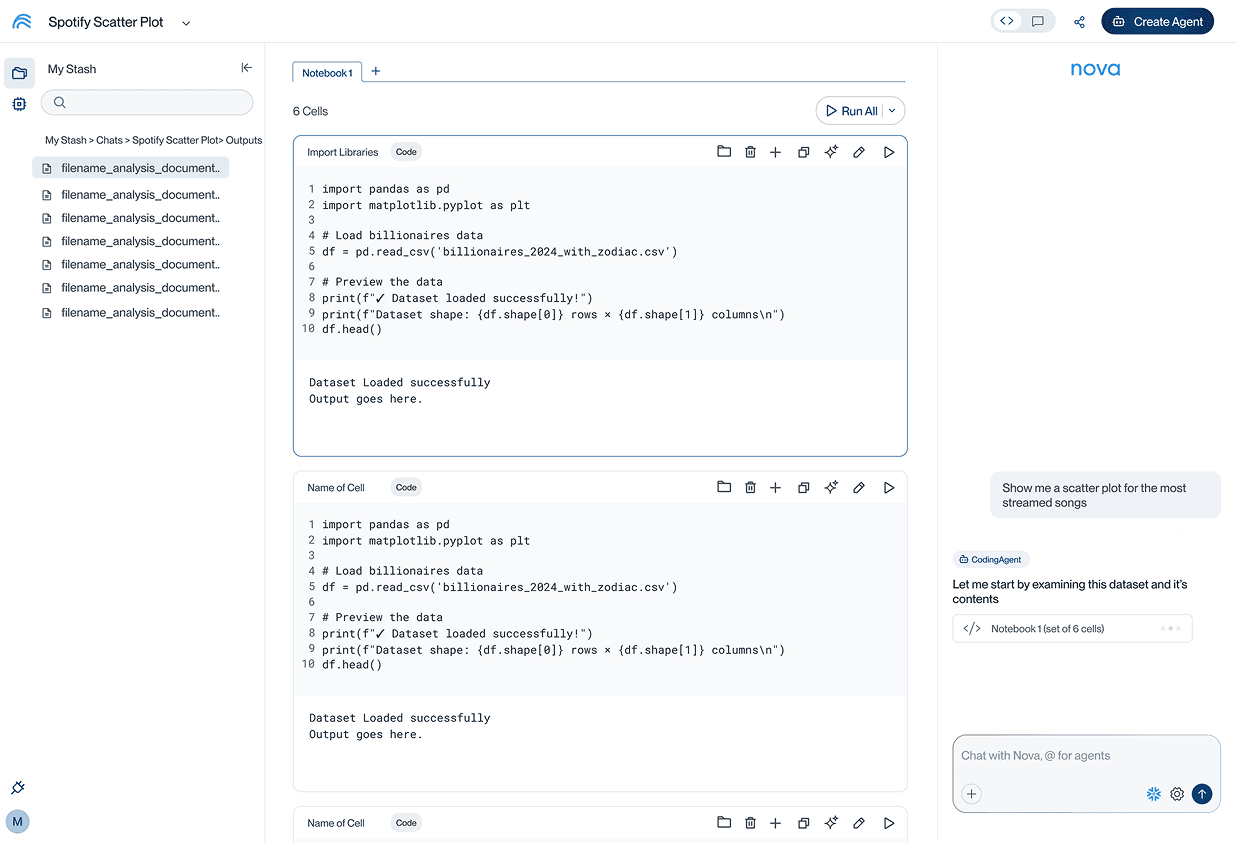
Notebook view shares the same focused nav.
Home to workspace to notebook. The primary nav steps aside once you’re working.
The primary nav is one click away
The button in the top left of the workspace brings the full primary nav back over the notebook, so projects, chats, Stash and settings stay easy to reach without taking up space.

This was the best solution because we didn't have to sacrifice our primary nav or convert existing pages to sidebar sizes, and it accommodates both data scientist users and non-technical users.
Outcome
112–217
sessions / week
Notebook use since launch
A capability the product didn't have before
531
new users, peak week
Signups through the launch period
Up from roughly 200 / week
674
sessions / week
Jupyter use, still climbing
Up from 290 / week in July
6–8%
of weekly actives
Reach of the notebook view
The number I'd work on next
The notebook shipped in August and has been in steady use since. Signups climbed through the same period, though marketing was running alongside the launch, so I wouldn't attribute that growth to one feature.
Jupyter usage kept growing too. My read is that this is habit rather than preference - Jupyter is where these users have worked for years, and one in-app feature doesn't undo that in a quarter. Switching is a longer arc that depends on more than any single release.
What did change is the constraint. Before this, Camber had no answer for the part of the job data scientists spend most of their time in. They had to leave the product to do real work. That's no longer true, and the platform can hold the whole workflow now.
I pulled these numbers myself in PostHog, querying them through Nova.
Final Thoughts
There was a lot of cool design work I got to work on here but the most fun challenge to me was the architecture and navigation aspect of it because it was like a navigation puzzle and I'm naturally a big picture thinker.